Following yesterday’s article where we explored the longer-term, high time frame structure for Bitcoin, today we shift focus to the medium and lower time frames. We will analyse the daily chart and zoom in all the way to the intraday levels to see what current price action is telling us.
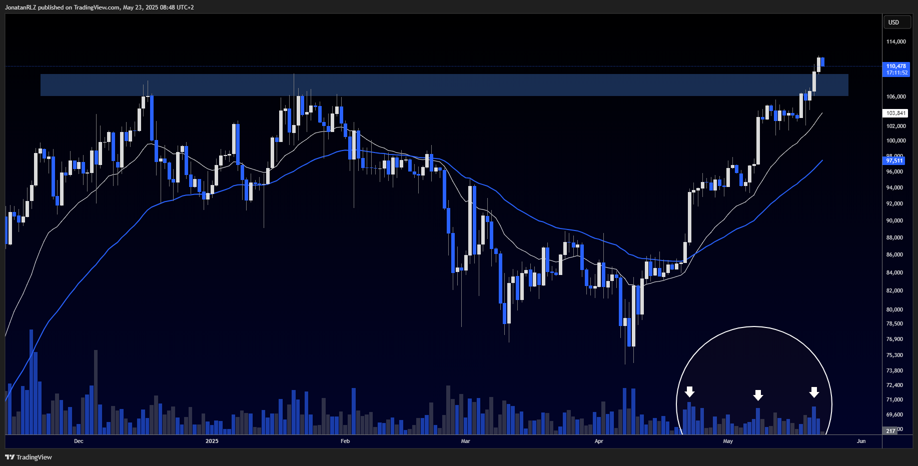
Starting with the daily, Bitcoin has now confirmed a clean breakout above the previous all-time high at around 109,000. What makes this breakout particularly noteworthy is the clear volume spike that accompanied the move. As marked by the white arrows on the volume bars, this is consistent with every other confirmed breakout in recent history, further reinforcing the principle that volume confirms price.
We also see a strong and steady uptrend, with price bouncing around the white 20 EMA, which remains well above the 50 EMA. Both moving averages are sloping upward, indicating a healthy trending structure. Most importantly, we now have both a daily open and close above the previous all-time high, offering added confirmation that this breakout could hold.
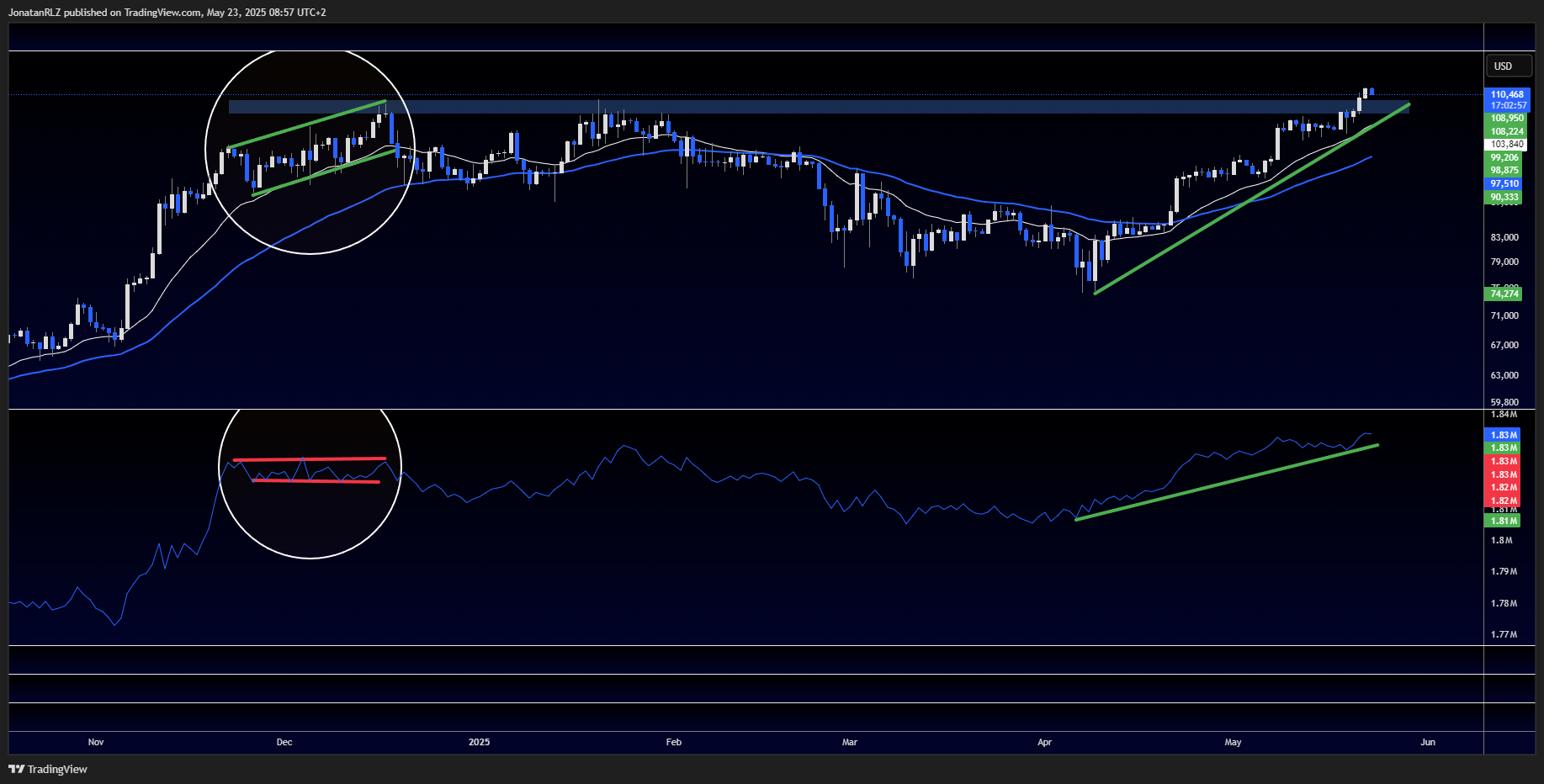
Still on the daily time frame, we now shift our focus from traditional volume bars to a volume-based indicator called OBV, or On-Balance Volume. For those unfamiliar, one useful way to apply the OBV is by looking for divergences between the indicator and price. This can help identify potential weakness or strength in a trend.
To illustrate this, we’ve marked out two white circles on the chart showing a specific period of price action alongside the OBV. During this time, we can see price forming a clear trend of higher highs and higher lows, as outlined by the green trend lines. However, the OBV was printing equal highs and equal lows, which created a bearish divergence. In a healthy uptrend, we typically want to see OBV confirming the price structure by also forming higher highs and higher lows.
Now, looking at the current structure, both price and OBV are in uptrends with no divergence present. This alignment between volume and price adds further strength to the bullish case and supports the idea that this trend is currently intact and healthy.
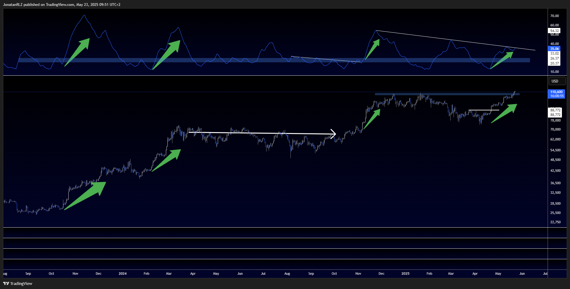
We remain on the daily time frame for this section, shifting our attention to the ADX, or Average Directional Index. For those unfamiliar, the ADX is a technical indicator used to measure the strength of a trend, not its direction. A rising ADX suggests a strengthening trend, whether it is bullish or bearish, while a falling ADX indicates weakening momentum.
It is important to understand that the ADX is a lagging indicator, meaning it reflects past price action. While it may seem obvious in hindsight, it is not ideal for predicting tops or bottoms on its own. However, when combined with other tools, like volume analysis and market structure, it can help form probabilistic assumptions.
Traditionally, an ADX reading above 20 is considered a sign of a strong trend, but this can vary by market. For Bitcoin specifically, historical data suggests that a more accurate threshold for trend strength lies between 20 and 25. This zone has been marked with a blue rectangular band on the chart.
Reviewing past price action, we observe that breakouts occurring while the ADX is sloping downward, or while it is below this 25 level, often result in fakeouts. In contrast, successful breakouts tend to happen when the ADX is climbing and above this threshold.
Looking at the current structure, we can see that since the beginning of April, Bitcoin’s ADX has been forming a healthy uptrend. The line is sloping upward and is now approaching a descending trendline on the ADX itself, which, if broken, could signal further strength. This adds to the evidence that the current uptrend remains intact and no major top has been formed yet on this indicator.
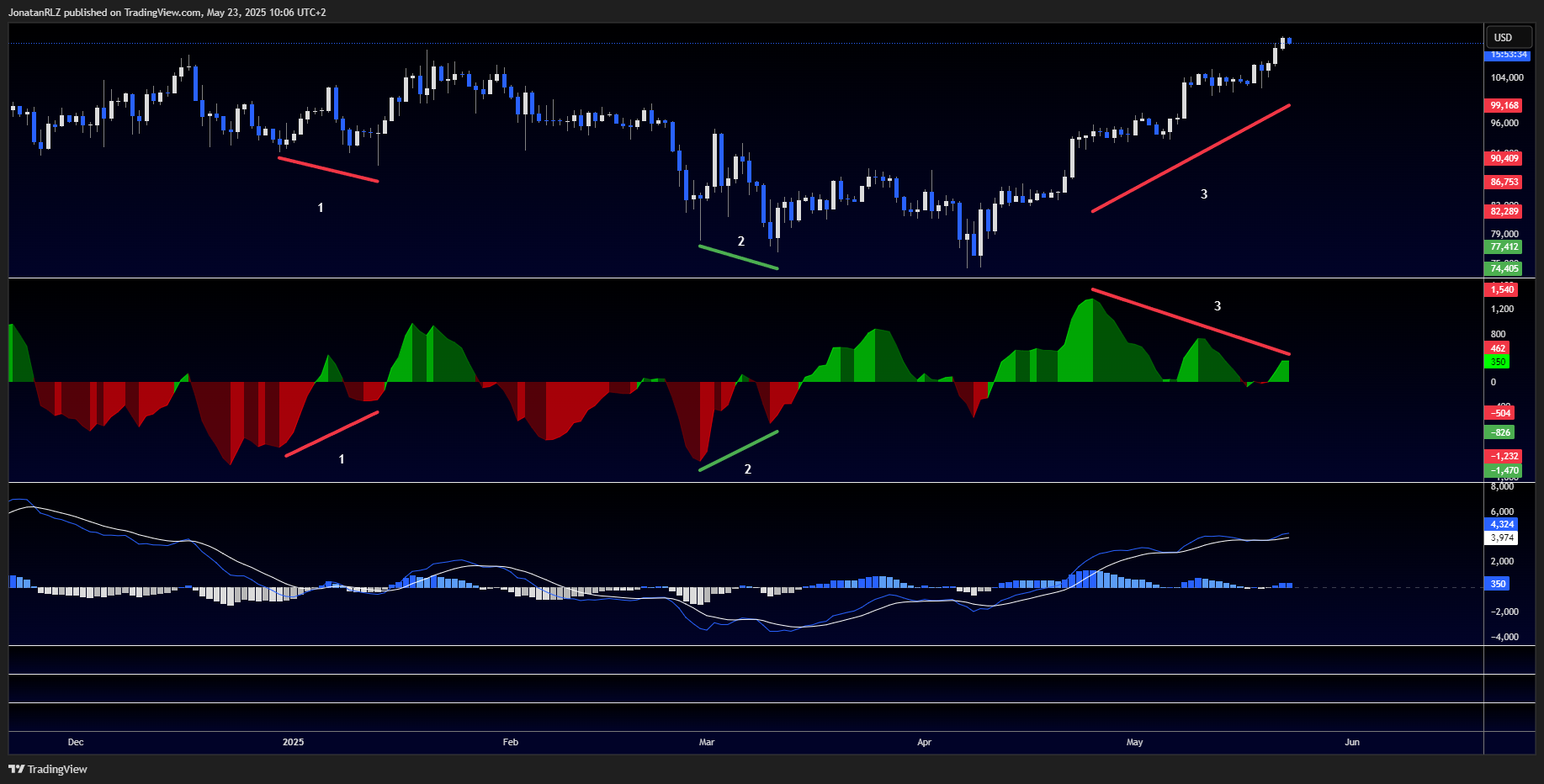
We now shift our focus to one of the most widely used technical indicators in trading, the MACD, or Moving Average Convergence Divergence. While many traders focus on the MACD line and signal line, in today’s update we are primarily interested in the histogram, which represents the difference between the two lines and provides a view into momentum shifts.
At the bottom of the chart, you’ll see the standard MACD setup, with the MACD line and signal line plotted in blue and white. Between them, the histogram bars reflect the strength of momentum. To make analysis clearer, we’ve added a secondary, magnified histogram indicator above, which highlights momentum shifts more visibly.
Our main focus here is on MACD histogram divergences. A bullish divergence forms when price prints lower lows while the histogram makes higher lows, suggesting bearish momentum is weakening. A bearish divergence forms when price is printing higher highs, but the histogram is declining, indicating a potential slowdown in bullish momentum.
On the chart, we’ve marked three relevant divergence patterns. The first shows a previous bullish divergence that preceded a local bullish push to the upside. The second reveals a bullish divergence followed by a breakout to the upside. The third is the one currently in play, a bearish divergence that has formed while price continues to rise and the histogram prints lower highs.
While this does not confirm a reversal, it does suggest the current uptrend may be losing steam. Divergences like this can indicate a short-term retrace or sideways consolidation, even if the larger trend remains intact. Although the MACD is typically a lagging indicator, divergence analysis can give us a forward-looking signal by showing cracks in momentum.
It’s important to balance this with our earlier analysis of the different indicators above, which still suggests strong trend conditions. When combined, these signals tell us that the broader trend remains bullish, but there are early signs of potential cooling. This highlights the importance of being alert to any short-term changes in price structure.
Next, we’ll drop into the lower time frames to see if price action and structure can help us confirm or refute this divergence setup, and to identify actionable levels for intraday risk management.
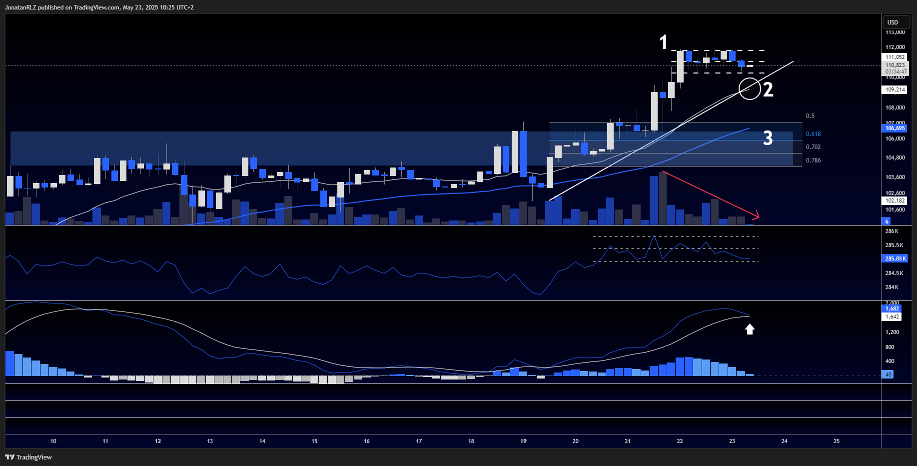
Looking at the 4-hour chart, where we combine price action analysis with the OBV (On-Balance Volume) and MACD indicators. Following previous observation of a potential bearish divergence on the MACD histogram on the daily timeframe, we are now starting to see additional signs that support this thesis on the 4-hour chart.
Let’s start by addressing the current price structure. After the recent breakout into new all-time highs, Bitcoin is forming what appears to be a consolidation range, marked as zone 1 on the chart. This is typical behaviour following a strong move and suggests that the market may be cooling off before deciding on the next direction. A confirmed breakdown below the range lows would be a strong indication of short-term weakness and possible further downside.
Next, we turn our attention to the area marked as zone 2, where we see a rising trendline aligned perfectly with the 4-hour 20 EMA (white line). This trendline acts as dynamic support for the current move. However, there are some warning signs beginning to emerge.
Most notably, we observe a bearish divergence on the OBV. While price has continued to climb and break out to new highs, the OBV has been locked in a sideways, range-bound structure. This tells us that the upward move is not being confirmed by increasing buyer volume, a key requirement for sustainable trend continuation. Supporting this, the volume bars show a clear downtrend, as marked by the red descending trendline, indicating fading interest.
If the price breaks below the trendline and 20 EMA in zone 2, this could open the door for a move down into zone 3, which lies between the 50% and 0.618 Fibonacci retracement levels of the recent breakout. This is also where we find the 4-hour 50 EMA, adding further confluence as a strong support area and a possible target for any corrective move.
At the bottom of the chart, we also see a potential MACD bear cross forming. While not yet confirmed, this would traditionally be interpreted as a sell signal and may further validate the weakening momentum we’ve been observing.
Taken together, the structure we are seeing on the 4-hour timeframe provides some support for the earlier observations of bearish divergence on the daily MACD histogram. Let’s now move into the lower intraday timeframes to examine the local range more closely and identify potential levels for short-term risk management and directional bias.
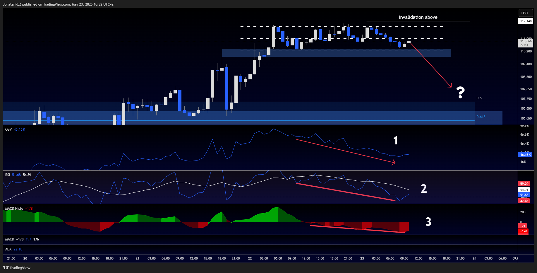
We now drop into the 1-hour timeframe to take a closer look at Bitcoin’s current price structure. What we’re observing here is a well-defined ranging pattern, and given the context of the previous breakout, this could potentially be a low timeframe distribution range, a common structure before a momentum reset or a larger corrective move.
Starting with the OBV indicator (marked as 1 on the chart), we see clear signs of bearish volume divergence. While price has been moving sideways or slightly upward within the range, the OBV has been trending downward, signalling that volume is not supporting the current price action.
Below that, the RSI (marked as 2) tells a similar story. Price has been forming local higher highs, but the RSI is making lower highs, another textbook example of bearish divergence, showing weakening momentum.
Lastly, the MACD (marked as 3) also shows a divergence, with the histogram and MACD lines sloping down while price attempts to climb. This triple confirmation from volume, momentum, and trend-following indicators suggests that the current consolidation might not have the strength to push higher without a reset.
That said, we all know how Bitcoin behaves. It often defies expectations, breaking out when it seems least likely, or dropping suddenly after long periods of stability. For now, this analysis presents a probabilistic setup, not a prediction.
The invalidation of this thesis is clear: if Bitcoin breaks above the current range highs, we would once again enter price discovery and the analysis of this range as distribution would no longer be valid.
Remember, in trading and investing, risk management is everything. Even with strong signals, nothing is guaranteed. The market is a game of probabilities, not certainties.
Trading involves risk.
The financial products offered by the Company are complex and come with a high risk of losing money rapidly due to leverage. These products may not be suitable for all investors. Before engaging, you should consider whether you understand how these leveraged products work and whether you can afford the high risk of losing your money.
The Company does not accept clients from the Restricted Jurisdictions as indicated in our website/ T&C. Some services or products may not be available in your jurisdiction.
The applicable legal entity and its respective products and services depend on the client’s country of residence and the entity with which the client has established a contractual relationship during registration.


